It's time to make your colour speak!
Colour Stories and Relationships
SPRING 2020 Deadline Mar. 20th
How to communicate with colour and create perfect harmonious colour schemes in your paintings.
This is a Toronto technical painting course. REGISTRATION Closed
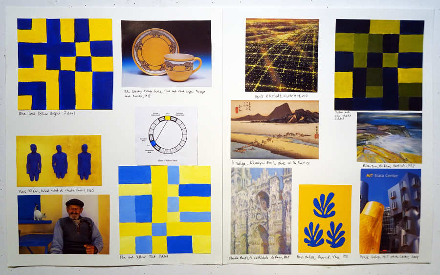
This is page of the extensive books I've constructed as teaching aids. On these pages above you see two colour combinations Yellow + Blue. This is from Class 3.
Do you struggle with choosing the right colour palette for you're paintings?
What makes some colour combinations look great together? Why do some paintings just work?
When starting a painting do you struggle with how to begin?
Are your colour choices just off but you can't figure out why?
Do you want to simplify your paintings to make them stronger?
Did you know there's a way to solve every painting's colour problems?
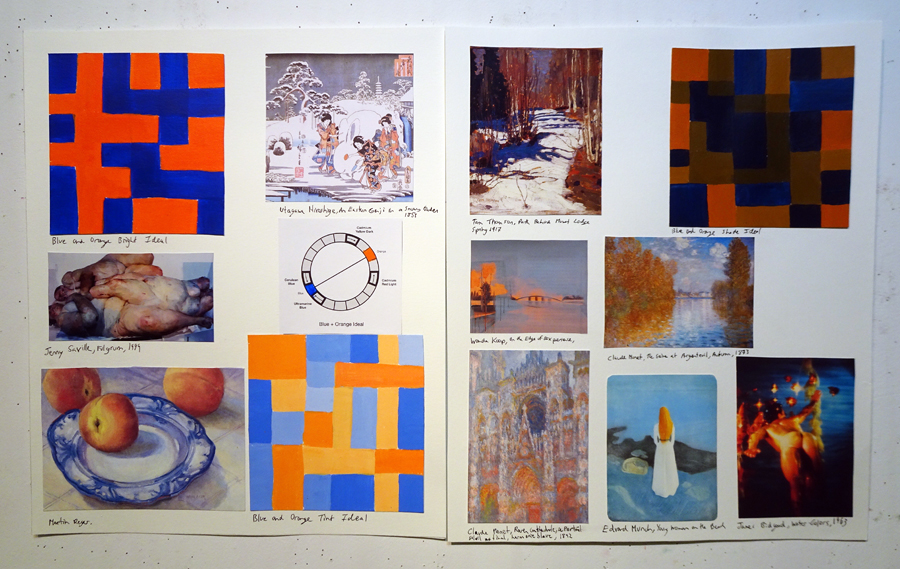
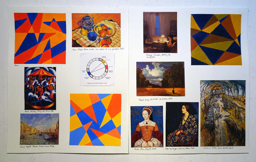
This is from Class 4: Complimentary Colours. This time Blue + Orange. Notice how in many images the effect is a cool peacefulness.
The colour combinations
you choose tell a story.
Colour is a form of communication. To me, the aim in any communication is clarity and resonance. If you make a painting about loneliness and people interpret it as upbeat then something has gone wrong. You’ve made choices along the way, either consciously or unconsciously that don’t communicate your message. Colour in different relationships has different effects - it changes the story.
Some colour combinations sing. They look beautiful together. Others just don't look good. But why? What's causing them to be harmonious or not?
Colour schemes communicate different narratives in your artwork by creating moods, feelings and associations. The colours you choose not to use are equally important. In this course we'll be gaining consciousness of colour relationships and harmonies so you can learn to perceive them in other people’s artworks and then incorporate them into your own. You'll also start to see them everywhere you go. You'll see them in films, ads, fashion, interior design. Understanding these methods is a major key to making successful paintings.
In fact, this is probably the main thing you don't realize you need.
One of the biggest mistakes I see students making is using too many different colours. Wanting a painting to be colourful doesn’t mean you need to use every colour. A lot of paintings just end up communicating "rainbow". That's great if your painting is about the Pride Parade but not ideal for most other things. Often the fewer colours you use the more clearly your painting will communicate a desired message.
The best artists are not just making it up. They're planning and thinking things through in advance or during the process. They’re designing a colour scheme and working out a palette. They stop to think, adjust and edit. Decisions are always being made.
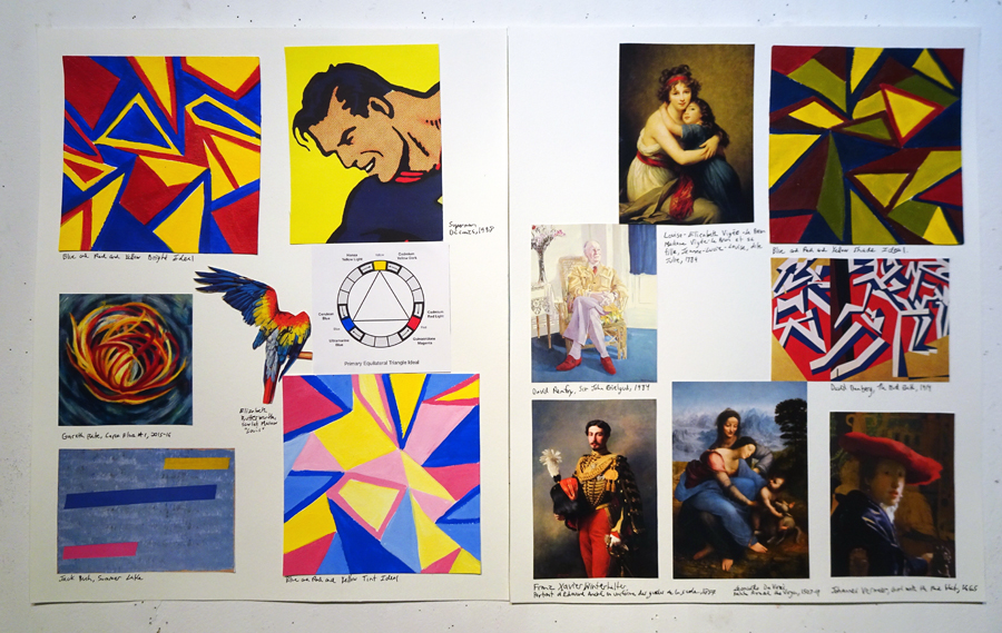
This page features a primary colour triangle from Class 5. Here the combination is Yellow + Blue + Red. Notice how on the left the colours are loud and in your face. But on the right the colours are toned down in subtle ways. The yellow is more mustard and the blues grayed. Primary Blue + Red + Yellow is a super obvious colour palette but when it's done with sophistication you don't even notice that it's following this colour scheme.
Here's How the Class Works
I created Art School Untangled to teach one of a kind courses that you can't find anywhere else. These courses get right to the heart of problems students face and focus intensely on a single issue. They're about putting in a lot of work over a relatively short period of time so that you can save YEARS of struggle. There's a lot to learn in painting and drawing but it doesn't need to take you decades if you learn it right from the start.
This course is part of my technical painting trilogy and is as crucial as The Colour Mixing Detective and Brushstrokes and Painting Effects. The Colour Mixing Detective is all about learning to MIX colours. It's like doing CSI forensics on art history images. We focus on looking deeply at how artists mix their paints. We do a ton of colour charts! You learn to understand your pigments and how to mix a huge level of nuanced beautiful colours.
Colour Stories & Relationships is about learning to actually USE colour.
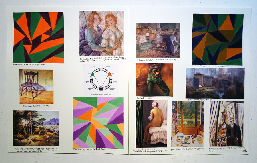
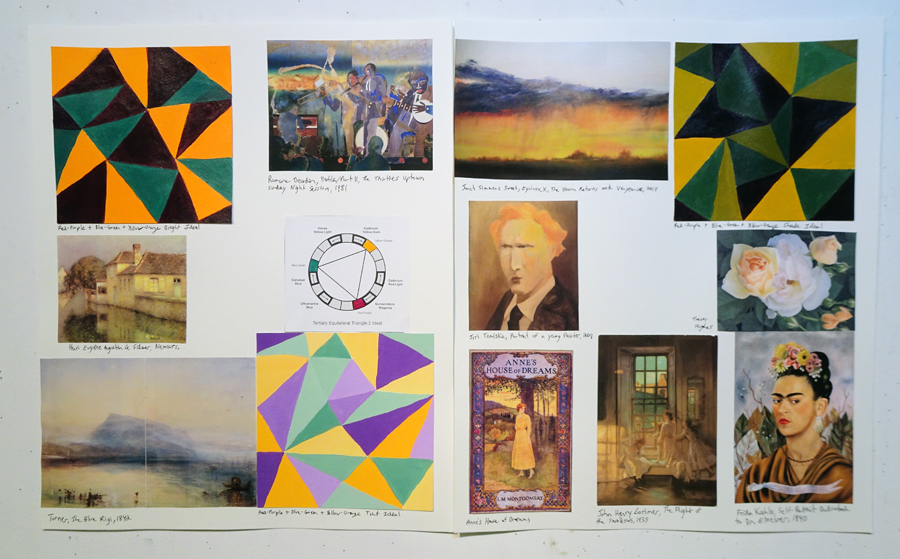
This is from Class 5 where we talk about three colour primaries and secondaries. This one is Green + Orange + Purple.
Colour Stories and Relationships
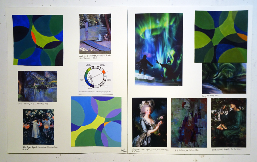
For each class we'll experiment with a different colour scheme. A colour scheme is the combination of colours used, rather than how they're mixed. Take a look at the book images throughout this info page. You'll notice a small graphic colour wheel on white paper. This shows each colour combination. You'll also see three square hand painted images. Those are what I call the Ideals. On the left is the "Bright" which uses pure colours, then below a “Tint” mixed with white, and on the right a “Shade” mixed with black. Notice how in the art history images on the pages the artists are following the Ideal colour scheme but they're doing it with sophistication. They change the tones, mix in earth tones or coloured grays, or alter the proportions of colours. In class we'll start simple with monochromatic paintings and then build gradually to more complex relationships with as many as four colours.
We'll learn how to think about colour and make decisions by designing your colour palettes so that you’re choosing the best colours for each new work - rather than just doing the same thing over and over again. You'll see how much is possible with a simplified palette. You'll experiment with combinations that feel uncomfortable and expand your range. I want to give you a deep understanding so you can solve the problems that come up in your paintings.
I’ve seen a noticable difference in sophistication in the paintings of my students AFTER having taken this course. They're also open to trying new colour schemes. There’s some framework rather than just guessing. I teach you a system. There’s some security in that. So within that framework, or restriction you can then play around, let go and see what happens. It actually makes painting way easier.
Here Catherine Turl created two paintings based on a colour scheme Red-Purple + Red-Orange + Green.This is a split-complimentary colour combination from class 7. Notice how she's separated the colours in the scheme on her palette. She's also incorporating earth tones like raw and burnt umber.
Homework
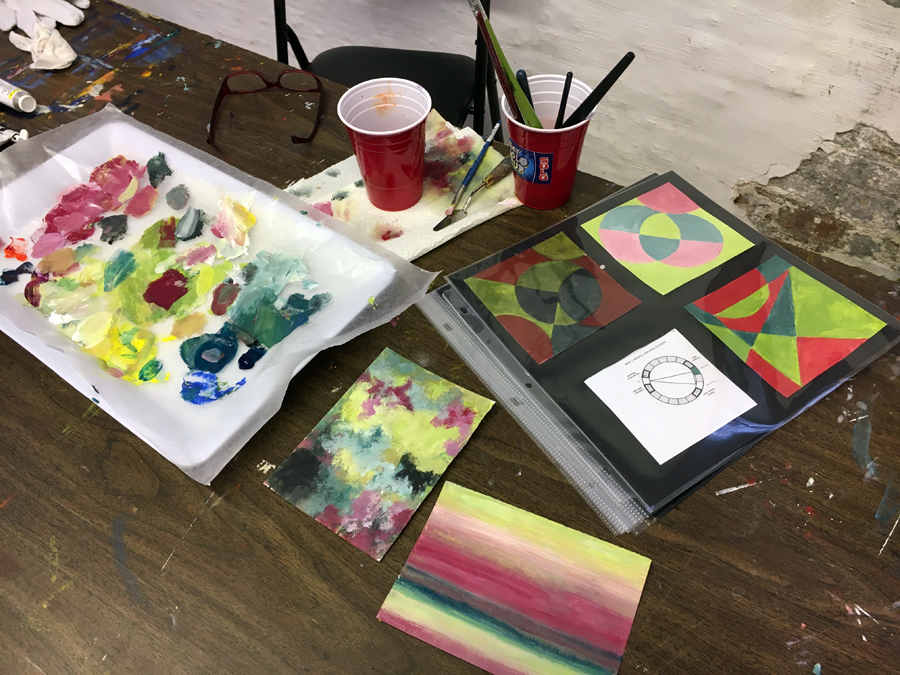
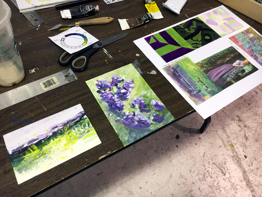
IDEALS: Each week, before the next class you’ll need to complete at least three small geometric "Ideals" (The painted images on the pages you see) which represent a colour scheme we’re discussing in the next class. If you’ve got time you can do more. I’ll give you several options to choose from. The more time you put in to this course in homework the better you'll do. The more charts you do, the more you'll learn. You should be prepared to put in at least one hour of homework a week minimum.
IMAGERY: Throughout the 10 week course you’ll be collecting imagery to create a beautiful book that brings all your class work together into a life long reference guide. You’ll be matching your ideals with images. The books I've created are invaluable to me. I look at them all the time as a reference to help me fix problems in my paintings. The easiest way is to buy a used art history book and cut it up! The Art Toronto art fair is coming up this fall and is a perfect place to collect cards. IMPORTANT NOTE: The book pages you see on this info page are for my teaching purposes. I have zero expectation that you would be as elaborate as I was! (I'm very into this!)
In Class Work
AGO Tour: We start the class with a tour of the AGO where we'll look at paintings from the perspective of their colour stories. Part 1 we begin with looking exclusively at snow scenes and how changing the colours used completely changes the mood and narrative of a similar subject matter. In the second half we'll look at the modern art section.
LESSON: At the start of class we walk around and talk about your work. We’ll look at any imagery you found and where it might fit into your book. Next I give a presentation where we’ll discuss the weekly colour relationships. We’ll look at real world examples of how historic and contemporary artists use these schemes in surprising and fascinating ways that are not at all obvious. Sometimes the schemes are very subtle. That’s the key. There’s so much more going on than you might realize. We’ll talk about the vibe and overall effect of these colour schemes. What kind of mood or feeling do they convey?
DEMONSTRATION: After our discussion I do a painting demonstration where I show you different ways you might approach using this colour scheme in nuanced ways with your full colour palette. Each week I demonstrate a different appraoch to seeting up your palette and engage with the colour scheme.
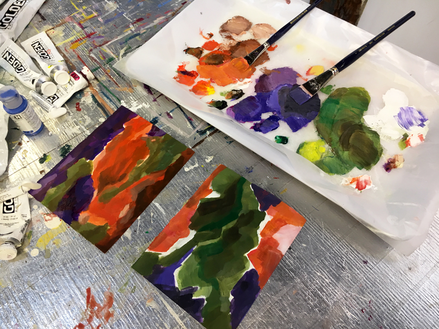
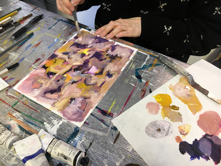
YOUR PAINTINGS: The studio work in class involves you experimenting with that new colour scheme. You're welcome to work abstract or representational. You’ll do small fast paintings based on the Ideal that you chose for your homework. This will push you to use colour combinations that might feel uncomfortable or challenging. As you can see on this info page students worked in many different ways. Some chose an approach and then repeated that throughout the course so just the colours changed but the image stayed more of less the same.
Here Christine Dart is doing her own painting in a Purple + Yellow complimentary colour combination. Notice how when the time comes to do a real life painting we can use ochre as the yellow and incorporate neutrals like Titan Buff and Naples Yellow.
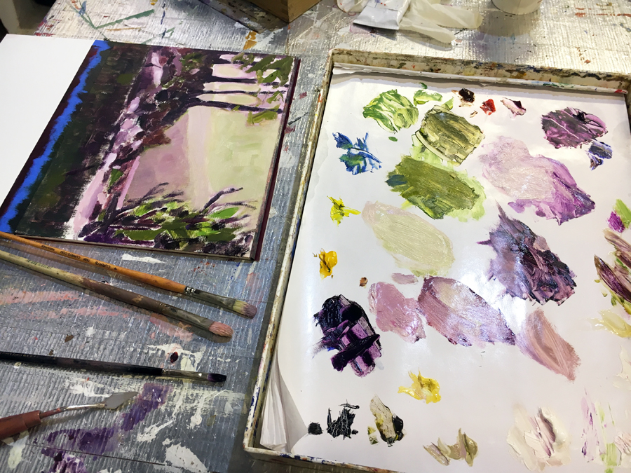
Here David Serber is recreating his landscape painting. Throughout the course he used the same image and changed the colours into a new scheme each week. It was very cool. This one is Purple + Green.
“This course is for anyone who’s working with colour in their day to day life, anyone painting, or interior decorators, fashion or textile designers. It simplifies colour in a way, and helps to show how complex the relationships between colours can be. I don’t think people are born with this ability. That’s a prevailing mythology that you’re either a painter or you’re not. I just never had time before. I think if people can spend more time doing it, then that’s how you learn and get better.
There’s many benefits to the course. Doing colour charts gets your head into colour. There were so many charts to do, but I wanted to do them all! For me, the way I begin a painting is with colour. The painting emerges out of that. So it’s absolutely foundational. It’s made me spend more time looking at other people’s work and to see how they’re selecting their colours. I wanted to look at what colours worked well together. There’s no question in my mind that the course was great for that. Now it’s much easier for me to zero in on what I like about a painting. If there’s something happening that doesn’t look right, I think I’ll be able to pick it up now. I understand better what’s going on.
I’ve become more interested in trying different colour combinations in my own paintings. That’s a good thing because I tend to use the same colours all the time. That’s pretty limiting and boring. It’s going to be fun exploring and using other colours and seeing where it takes me. Now something different is happening in my paintings. I’m very happy about that. The two colour courses have really taken me to the next level in my painting. I’ve found them very helpful. This has been a great course and I’m really glad that I’ve taken it.” - Catherine Turl
This page features a split complimentary from Class 6. So rather than Blue + Orange this is Blue + Red-Orange + Yellow-Orange.
Why small fast paintings?
For several years I made hand painted greeting cards. I’d sit down and churn out more than 20 of them in a row. Just painting away, with no intentions, whatever. The result was often surprising. They looked really great and were often looser and more expressive than my actual work. All sorts of interesting imagery emerged. How could that be when I was barely even trying? I firmly believe the best way to approach making art is to “not give a crap”. That’s not to say that you don’t take it seriously, but rather you don’t worry about the outcome. In class by doing these fast small paintings that don’t matter, you’ll take the pressure off to make great works of art. You play around and see what happens. The result is often actual progress.
Weekly Colour Schemes
Week 1: TOUR at the Art Gallery of OntarioWeek 2: My Tonal Colour Wheels and Ideals
Week 3: One Colour
Week 4: Two Colours: Primary and Secondary
Week 5: Two Colours: Tirtiary
Week 6: Three Colours: Primary, Secondary, Tirtiary
Week 7: Analogous Gradations
Week 8: Three Colours Part 1
Week 9: Three Colours Part 2
Week 10: Into to Four Colours
This one is Blue-Green + Yellow-Orange + Red-Purple.
Art Untangled
Colour Stories and Relationships
How to communicate with colour and create perfect harmonious colour schemes in your paintings.
DETAILS
Registration: OPEN
Instructor: Gareth Bate
City: Toronto, Ontario, Canada
Class Location: My studio at 401 Richmond St. West, Studio S-17 in the Basement orange section. (At Richmond & Spadina.) See Google Map.
Number of students per class: 8 maximum
Class Dates: Spots Remaining: Spots Remaining:Course Duration:
Price and Registration Info at the bottom of this page:
Important Note: You must be able to attend the first class. It's essential. If you're unable to do this first class but are available for the rest of the course let me know. We could make an arrangement to do a private lesson during the first week for $100. Or you could attend the first class with the other class.
Your painting supplies are not included - see full list below.
Dates:
Dates don't work?
If you're interested in this course but these dates don't work for you be sure to subscribe to my newsletter so you get updates from me about future courses. I change the days and times each semester. Also shoot me an email to let me know that you're interested. contact@garethbate.com
SPECIAL OFFER:
You can SAVE $50 off your course price if you sign up a friend for Fall for either this course or The Colour Mixing Detective who hasn't taken my courses in the past.
Need to miss a class?
No problem, I got you covered!
I'm offering one FREE BONUS Sunday morning makeup class - Dates to be arranged with the class.
Here Carol Turl has done paintings and Ideals based on a colour combination from class 7 Red + Blue-Green + Yellow-Green.
“I enjoy your courses and I learn something from each one that I take. I’ve taken a variety of courses throughout the city and I like yours. We were learning about the use of colour combinations to invoke feelings, moods and unity. We were learning about our own reactions to how colours were used in paintings. I have a much better understanding of my own feelings about colour. I thought it was very interesting to use the colours on the palette and see if we could put them together into something that was attractive and thoughtful.
I enjoyed doing the homework Ideals and the precision of painting them. That in itself was kind of fun. I do stained glass and it’s very precise. The Ideals are perfect for stained glass. In class you said - ok now paint something. That was a bit of a shell shock. Oh, I have to do something that’s loose and unstructured and off the top of my head?! That was a bit of a stretch for me. And I enjoyed it. Your feedback gave me confidence to feel that that I could do something. I was very pleased with your talking about depth and how to achieve it. How to make some things go forward and something go back. I really felt that I learnt a lot. I progressed. It was an excellent course.” - Carol Turl
Here David Barron has done some small paintings and ideals based on the colour combination of Green + Purple.
Course FAQ
I did The Colour Mixing Detective course. Is this really worth doing another colour course?
Absolutely. These are two totally different courses. Both address issues of colour but from different perspectives. The other class was all about mixing colours, understanding pigments and seeing the nuance. This is about using colour and how to compose paintings using colour relationships and then applying it to your own work. That's something we don't cover at all in the previous course.
This sounds like a lot of work, I’m a little intimidated…
My classes are for real and designed to master the subject matter. They’re one of kind and intensive. It's a time investment. There’s the potential to do a lot of homework. I would suggest not taking another course at the same time. This will be more than enough work. Finding imagery takes time but you’ll have 10 weeks to do it. You’re only required to paint three ideals each week. So any additional ones you do are your choice. You’ll have lots of time in class to do your experimental paintings.
I'm trying to decide between doing The Colour Mixing Detective and Colour Stories and Relationships. Which one should I do first?
In The Colour Mixing Detective we go into great depth on mixing colours. By mixing them you start to see the full range of colours. They are two very different but totally complimentary courses. I'd suggest reading through both info pages fully in order to make your decision. Generally, I'd say if you're new to painting then doing the The Detective first is better. If you have some experience then either would be fine.
I work in the film/theatre/makeup/fashion/interior design industry would this class work for my professional career?
Absolutely. The course is geared towards fine art painters but I've had a number of students go through The Detective who have worked in set painting, makeup design, fashion and interior design. They've found it very helpful and applicable to their careers. I think this course is as useful as the other one. This course would be extremely valuable to interior or fashion designers. Send me an email if you have questions about whether the course would work for you.
I need to miss the first class, can I still take the course?
You can't miss the first class. Missing the first class will make it impossible to follow. However we could make an arrangement. We can arrange to do a private lesson for $100 in my studio either before the course starts or in the week leading up to class 2. Let me know.
What are your plans for COVID-19?
The 401 Richmond building has hand sanitizer at the front and back entrances and they do a good job of keeping it clean. I encourage you to wash your hands when you arrive. I will also be wiping down the table surfaces regularly with disinfectant. My intention right now is to proceed business as usual until things change. One has to “Keep Calm and Carry On”, no? All the homework assignments are pdfs with full written instructions with pictures. They are completed from home with no problems. This has always been the case with my courses. So half the course already operates “online”. Some students choose to print out the pdfs at the print shop rather than look at the screen. So it works great! You will also have access to all the photos we work from early in the class and I will be teaching you how to figure out how they were made. If some kind of lock down were to occur I would continue to run the course as best I can via email with the assignments. We would then make up some of the missed studio demos later. Perhaps in a more condensed format. I’ve cleared my schedule on Saturdays in the spring and summer to potentially accommodate a spill over of my semesters if there is a gap period. As of right now I'm running my courses normally, while taking the same precautions that everyone is taking.
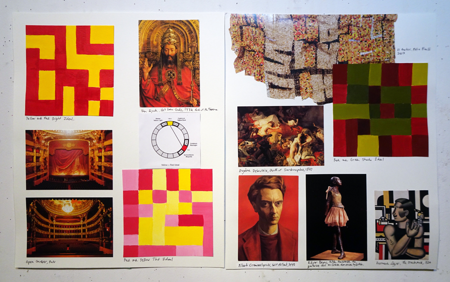
This is a Red + Yellow combination page from Class 4. Notice how there's a general vibe of sophistication. It conveys a regal feeling.
Materials FAQ
I'm unsure about this course because of the price and cost of materials. Do we really need all these colours?
The course is 30 hours and breaks down to $15 an hour plus a free bonus class.
You need 8 fewer colours in this class than The Colour Mixing Detective. So this should be quite a bit cheaper. There are no new colours added. I totally understand the concern about the cost of materials. Trust me I have the same experience every time I go to the art supply store! Making art in not cheap. I've taught these colour courses to over 100 students and I've refined the course material list to the essentials. You won't regret buying any of these colours.
Can I leave things at your studio?
Yes, you can leave all your supplies and paper at my studio. However there is homework so you'll need your paints.
What brands of paint should I use?
Below I list brands and the full material requirements. I think you should always use artist quality paints from day one. One of the biggest issues students have with painting is using crappy student paints. By starting with professional paints you learn to paint once rather than having to learn twice when you end up switching. Good paint makes good paintings. In acrylic I'd say Golden. Oil I'd say Gamblin. Watercolour I'd say Daniel Smith if you have the money, or Windsor and Newton which is cheaper.
What medium should I use?
Acrylic: Most students work in acrylic as it's easy and dries fast. But if you plan to work in another medium for your paintings then use that medium.
Oil: Working in oil is fine. You just can't use solvents in the studio. They're not necessary. Water mixable oils are also totally fine. Oil is a beautiful medium. It's both a pleasure because it takes so long to dry, and annoying because it takes so long to dry. Students who work in oil need some kind of a box to carry their assignments in. Pizza box?
Watercolour: It's fine to use watercolour as long as you're committed to it as your medium of choice. Keep in mind that watercolour is very challenging. If you're just looking for a medium to use then I'd go with acrylic. If you intend to use watercolour then I have a separate paint list for you. I also have separate images that are watercolours to work from. Be sure to let me know if you intend to work in watercolour.
Unsure if this is for you?
Shoot me an email and we can chat about it. contact@garethbate.com
Ready? Continue on to join us!

About Me
My name is Gareth Bate and I’m a full time artist, curator and art teacher living in Toronto. I work in painting, installation and photography. I have an email newsletter called "Art Untangled" where I talk about art every week. You can subscribe here. I've been asked if everything I do revolves around art and the answer is pretty much yes!
I've travelled extensively and visited all the major museums in London, Paris, New York, Washington DC, Boston, Montreal and Cape Town. I'm Festival Curator of the World of Threads Festival an international festival of contemporary fibre and textile art in Oakville. I graduated with a BFA from OCAD University and a diploma from Central Tech's adult art program. I've been teaching since 2008. I’ve been featured on CBC News and Radio Canada and in the Globe and Mail, Toronto Star, Now Magazine and La Presse among others.
Here are the courses I teach: Art World Untangled: Museum Tours
Brushstrokes and Painting Effects
The Colour Mixing Detective
Colour Stories and Relationships
Outdoor Abstract City Drawing Part 1, Part 2, Part 3
Art History: The Masters: 1400-1850
Art History: The Moderns: 1850-1980
Abstract Painting
“Out of your two colour courses which one has impacted me the most? I’m going to say this course. I believe that the Colour Relationships will have a more lasting impact for me. I liked the homework of searching for paintings and photographs for the colours we were studying. That’s a huge exercise, and it made an impact on me beyond my own painting. I had experienced that moodiness but hadn't really thought about how it affected the observer. Now, I am able to enjoy art in galleries more because I found myself evaluating much more, identifying combinations of colour, the possible mood of the painter. It is was brilliant.
You are a calm supportive, encouraging teacher who likes to get your students "involved" in our own study. You work along with us not over us which in turn encouraged us to work with the paint and to work deep. You share your knowledge, your trained eye with your students. You have a nice way of saying “let’s go together on this.” We can rely on you to explore in a very safe way. It is a heavy and intense course but it made us work. It was really important to keep going and do lots of charts. It is a great course, I really liked it.” - Rosemary Miguez
This is from Class 6 about Analagous gradations. So one side of the colour wheel.
Essential Class Materials
Art Supplies are not included in the course fee.
3 large pads of WHITE watercolour or mixed media paper. Get ones where you can easily turn the pages rather than a block. Get HEAVY paper. Make sure you buy paper in a proportion that can fit into a sleeved portfolio. These will be the pages of your book. You only need one in class at the start.
A variety of paint brushes. You'll need some that are soft and flat.
Palette knife (Optional)
Pencil, Pen and Ruler
4 or more water containers. (For Acrylic or water colour. Clean yogurt tubs or dollar store plastic glasses)
1 medium to large flat palette of some sort. Don't buy a watercolour palette with different sections. Honestly the disposable sheet ones are great for this. There are palette's that use a sponge and can be sealed. These are great for keeping you acrylic paints wet. If you want to save money just get something in plastic like a tray.
A geometry set (Optional) I used a small geometry set with a compass and shapes to draw my Ideals.
Rubber, latex or cloth gloves It's a good idea not to get paint on your skin.
A rag or cloth to wipe your brushes on.
1 or 2 Portfolios with clear sleeves or a scrapbook. You don't need this until later. So wait to buy this.
Paint Colours:
It's crucial for all students to have EXACTLY these specific colours in regular paint tubes ready for the first class. This is the same as the previous class. I'll send you pdfs with the pigment codes for each brand of paint. Match the pigment code that appears on the tube. Note that for Part 2 I've made some colours optional.
I recommend you purchase artist quality brands. I believe it's important to learn to paint with artist quality brands right from the start. You should ideally stick to the same brand. Above Ground Art Supplies will give you a student discount if you show them the invoice for this course.
Hues: If the tube says "Cobalt Blue Hue" on it that means the colour is not the actual pigment. It's a cheaper alternative version. Try to find the actual one if possible.
Artist Quality Acrylics: Golden, TriArt, Windsor & Newton, Liquitex.
Artist Quality Oils: Gamblin, Grumbacher, Old Holland, Windsor & Newton.
BLUES
Ultramarine Blue
Cerulean Blue or Cerulean Blue Chromium
REDS
Quinacridone Magenta
Cadmium Red Light
YELLOWS
Cadmium Yellow Dark
Hansa Yellow Light or Lemon Yellow
WHITES
Titanium White
Zinc White
Titan Buff or Buff Titanium
BLACK
Mars Black
EARTH TONES
Burnt Sienna
Yellow Ochre
Raw Umber
Burnt Umber
Naples Yellow Hue
OPTIONAL (Colours we used in the Detective class. You are welcome to bring additional colours.)
Cobalt Blue
Quinacridone Crimson
Cadmium Red Dark
Cadmium Yellow Light
Phthalo Green (Yellow Shade)
Phthalo Blue (Green Shade)
Phthalo Blue (Red Shade)
Phthalo Turquoise
Raw Sienna
If you are planning to work in watercolour email me for a separate colour list.
So it’s time to make a decision.
You can continue to struggle with colour relationships
Or you can join us and master colour harmonies.
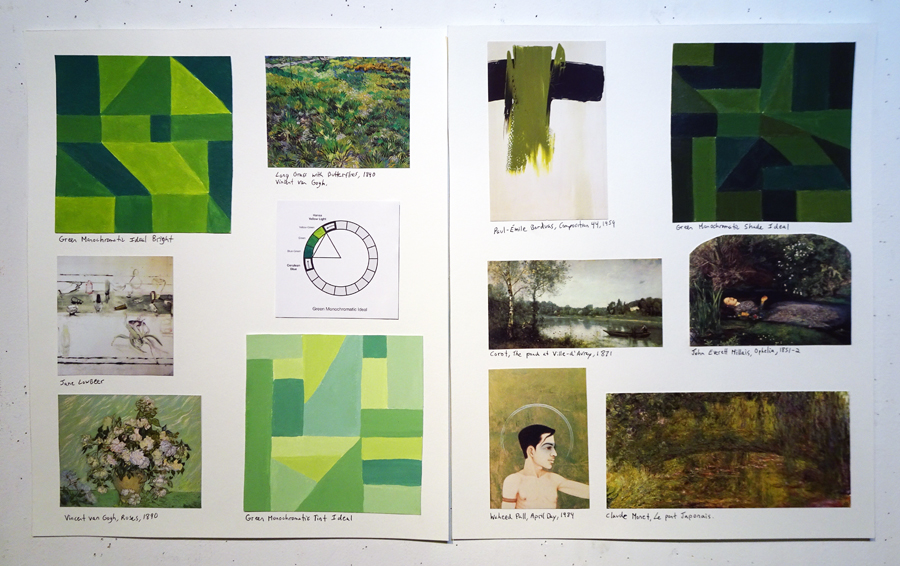
This is a Green Monochromatic from Class 2.
REGISTRATION DEADLINE: TBA
Register Now to
Reserve Your Spot!
Registration is OPEN
COST:
Ten Week Course + One Free Sunday Bonus Makeup Class
That's a 30 hour course which breaks down to only $15 an hour. Plus the free makeup.
Class Material Fee: There is a $50 fee for in class paint demonstration supplies and photocopies.
+HST
SPECIAL OFFER:
You can SAVE $50 off your course price if you sign up before Dec. 1st the Early Bird Deadline.
You can SAVE $50 off your course price if you sign up a friend to either this course or one of my other private courses who hasn't taken my courses in the past.
How to Pay
When you book I'll send you an invoice. You can then send me an online e-transfer. You could also pay by cheque mailed in advance of the course. Payment is required within two days of recieving the invoice.
Here's how to register...
Send me an email: contact@garethbate.com
Subject Line: Registration for Colour Stories and Relationships
What to include:
Full Name
Your Email
Your Cell Phone (so I can communicate with you if necessary)
What medium do you plan to work in?
Which class are you joining?
Payment Policy: Payment is required on registration within 2 days of recieving your invoice.
Payment Method: Online: e-transfer or cheque.
Your Expectations: Anything in particular you're hoping to learn?
What happens next?
After you register I'll confirm in an email and then send you an invoice and full course info and pdfs of the art supply list.
Still Got Questions?
Send me an email: contact@garethbate.com
I'm looking forward to seeing you!
Please share my courses with anyone you know who might be interested.
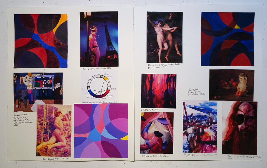
This is an Analagous from Class 6.