View on Canadian Art
"Come Up To My Room: 2012"
Andrea Carson
Saturday, Jan.29 2012.
Curtesy of the View on Canadian Art
Return to Press Menu | Read as Plain Text | View Website Source
View on Canadian Art
"Come Up To My Room: 2012"
Andrea Carson
Saturday, Jan.29 2012.
Curtesy of the View on Canadian Art
Return to Press Menu | View Website Source
My first impression, at this year’s emerging design exhibition at the Gladstone Hotel, which is titled Come Up To My Room, was that it wasn’t quite as strong as the past few years.
Looking through my photos, though I’m not sure that’s the case. The work is different, more conceptual perhaps. Overall, it’s more white so at first it all appears very similar. But really there is a broad range of intriguing beginnings of ideas that one hopes are pursued further by the artist-designers who created them.
There was promising young artist Gareth Bate, whose installation Jewel Net of Indra consisted of portraits painted on small silver mirrored discs. Figures as varied as Bob Marley and Terry Fox were featured – their only similarity being their celebrity.
Geo-Cognition by Wendy Fok was a spare installation of what looked like an exaggerated moulding curving around the floor and walls of one room. This was offered as a kind of riddle “There are 4 cities here – can you find them?” asked the designer. The answer is in the shadows, which depict the skylines of cities including Hong Kong and Manhattan. Interesting how closely the brain and the eyes are connected.
Two rooms – all white – by Ryerson’s [R]ED[U]X LAB and VAERY STUDIO, transform their spaces almost entirely. The first involves fabric stretched over a series of custom fabricated plastic bits bound together with elastic bands. When I was in the room, one of the designers was asked where they envision this piece being used in an interior. They don’t, they answered. It was more about experimenting with spaces, seeing things differently, which seemed to be a theme that ran throughout the show.
The second room used the window as a focal point from which fabric stretched dramatically outward. The actual room was completed transformed. Very simple, very effective.
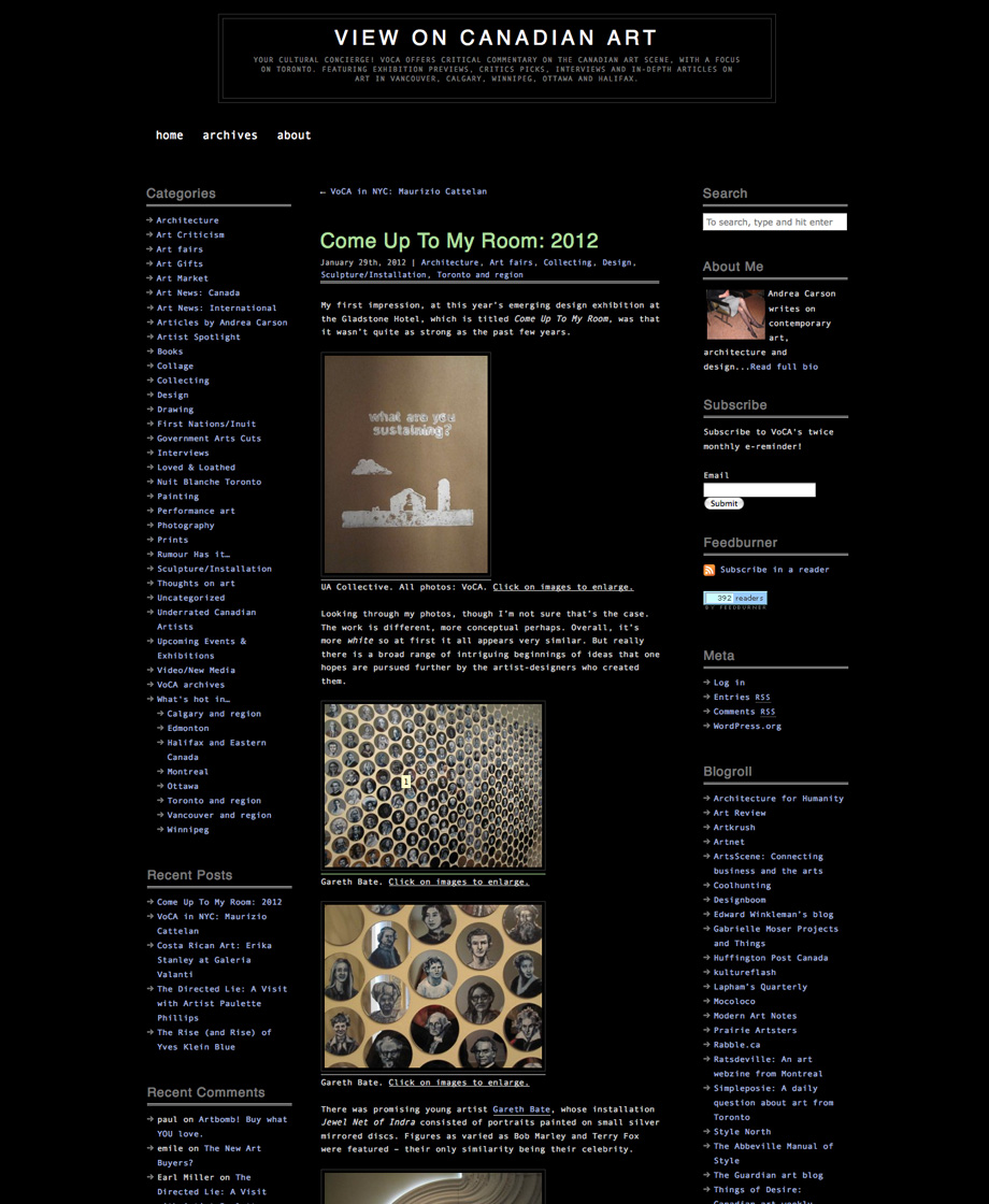
One installation, by UA Collective, featured a printing press of sorts. The walls were papered with printed kraft paper featuring fun, of-the-moment sayings like ‘LESS IS A BORE’ and ‘WHAT ARE YOU SUSTAINING?’
In the lobby was a neat idea for what I can only call ‘wall jewellery’. It was actually a ceiling installation made by Interstice Studio, a shimmering net of paperclips. Lovely.
Last but not least were two wildcard objects. In one room was a busy little installation by Tinsel & Sawdust, (below) but what I loved was how the painting and carpet seemed to be mirror images of one another. An idea with tons of potential, IMHO.
And then there was this crazy piece (above) by Lost Nation Design. There were faint lights glittering inside the canvas sac. I have no idea what it was actually for, but it sat at the end of the hallway like an exotic creature. Huh.